In today’s rapidly evolving digital landscape, mobile-first web design has transitioned from a forward-thinking approach to a fundamental necessity. As the number of mobile users continues to outpace desktop users globally, the importance of optimizing websites for mobile devices has become paramount.
This blog explores the critical nature of mobile-first design, emphasizing best practices and the benefits of adopting this approach, particularly focusing on advancements through entities like Web Design Dubai and Web Development Dubai.
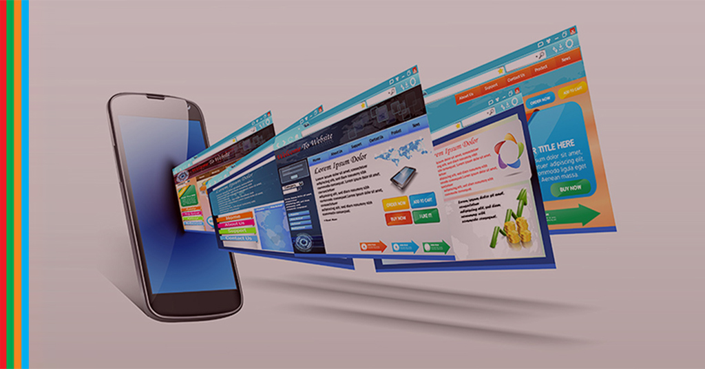
Understanding Mobile-First Web Design
Mobile-first design is an approach to web design and development where designing a website for smartphones and other mobile devices takes precedence over desktop design. This strategy is not merely about making a website accessible on a mobile device but rather designing it for the best mobile user experience before creating a version that will work on desktops.
The Necessity of Mobile-First Design
- Growing Mobile Usage:
With more internet users accessing the web via mobile devices than ever before, the mobile-first approach is not just logical but essential. Mobile devices are now the primary means of internet access for a significant portion of the global population, making mobile-first web design crucial for reaching a broader audience. - Enhanced User Experience:
Mobile-first designs prioritize load speeds, navigation, readability, and interaction – all tailored specifically for smaller screens and mobile conditions. These considerations are vital in providing a seamless and engaging user experience, which can significantly affect customer retention and conversion rates. - Improved Search Engine Ranking:
Google’s switch to mobile-first indexing underscores the importance of having a mobile-friendly website. Websites optimized for mobile rank better in search engine results, helping businesses gain more visibility in an increasingly competitive digital world.
Best Practices in Mobile-First Web Design
- Simplified Navigation:
Keep mobile navigation simple and accessible. A hidden navigation menu, often called a hamburger menu, saves space and makes the site cleaner without sacrificing user accessibility.
- Responsive Design:
Utilize responsive web design techniques that allow web content to beautifully and automatically scale to different screen sizes. This ensures that the website is effective and easy to use on any device.
- Optimize for Touch:
Design with touch controls in mind, considering factors like button size and ease of page scrolling. Mobile users should be able to navigate your site without any difficulty.
- Fast Loading Times:
Optimize images and leverage mobile-first coding practices to minimize load times. Mobile users often access the web on the go with varying internet speeds, making fast-loading sites critical.
- Prioritize Content:
Determine what content is most necessary for mobile users and structure it to appear early on the page. Mobile screens offer limited space, so it’s essential to display the most valuable information prominently.
Benefits of Mobile-First Web Design
- Broader Reach:
A mobile-optimized website reaches a larger audience. With more users accessing the internet on mobile devices, a mobile-first website is more likely to attract and retain visitors.
- Increased Engagement:
Mobile-first websites provide a better user experience, leading to higher engagement rates. Users are more likely to interact with a site that loads quickly and displays well on their devices.
- Competitive Advantage:
In many industries, mobile-first design can provide a competitive edge. Companies that prioritize mobile user experience can stand out among competitors who have not yet fully embraced mobile optimization.
- Higher Conversion Rates:
Well-optimized mobile websites typically see higher conversion rates. The ease and satisfaction of navigating a mobile-friendly site can directly influence a user’s decision to purchase or subscribe.
As mobile usage continues to grow, the shift towards mobile-first web design is not just a trend but a central component of modern web strategy. Entities like Web Design Dubai and Web Development Dubai are at the forefront of implementing these innovative practices, ensuring that businesses not only keep up with digital trends but also leverage them to enhance user experience and business outcomes.
Businesses looking to stay relevant in the digital space must adopt mobile-first designs to cater to the evolving needs of consumers and capitalize on mobile traffic. The future of web design is mobile-first – ensuring accessibility, engagement, and effectiveness across all devices.
For expert assistance in making your website mobile-first, consider partnering with Infobahn Consultancy. Embrace the mobile-first approach and transform your digital presence to meet the needs of today’s mobile-centric world.